

Artist Series Secret Lair: Inspiration

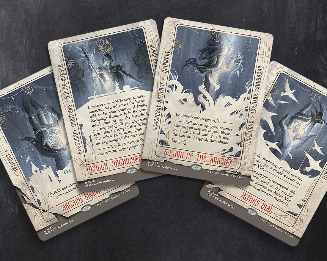
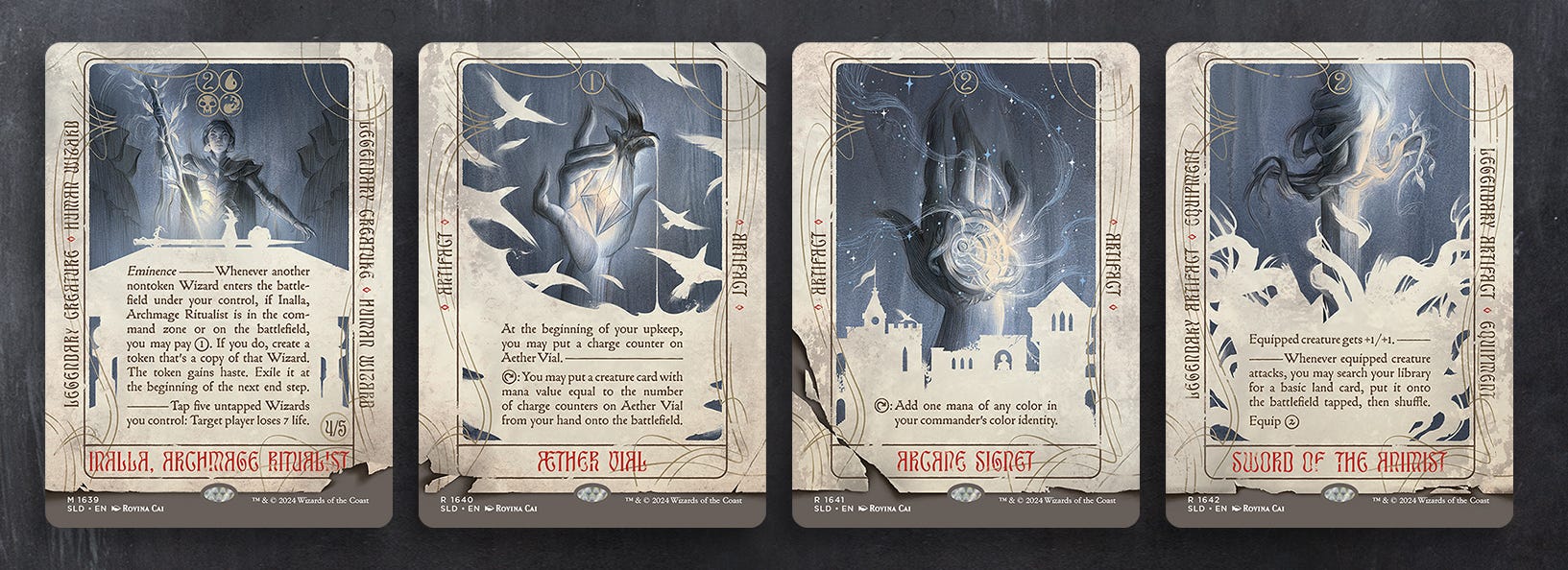
I recently revealed my MTG Artist Series Secret Lair. The series features four Magic cards in the style of antique Tarot cards, with each representing a suit in the Minor Arcana. In this post I’ll share some of the inspiration behind these cards, and in a later post I’ll delve more into the image-making process!
For Artist Series Secret Lairs, artists are basically given the freedom to do whatever they like, with minimal art direction. This is a little daunting, but also one of those rare opportunities to explore something out of the ordinary! With previous editions featuring cards that look like cereal boxes, or vintage monster movie posters, I knew I wanted to have a specific theme for my series as well, and for it to diverge from the regular design of a Magic card. As a book illustrator I often work on special collector’s edition books that are more artsy or experimental, and Secret Lairs seemed analogous to this.
A tarot theme was one of several ideas I pitched to my Art Director and the team at Wizards, and I was thrilled when it was chosen because there were some interesting parallels between Tarot and Magic cards.
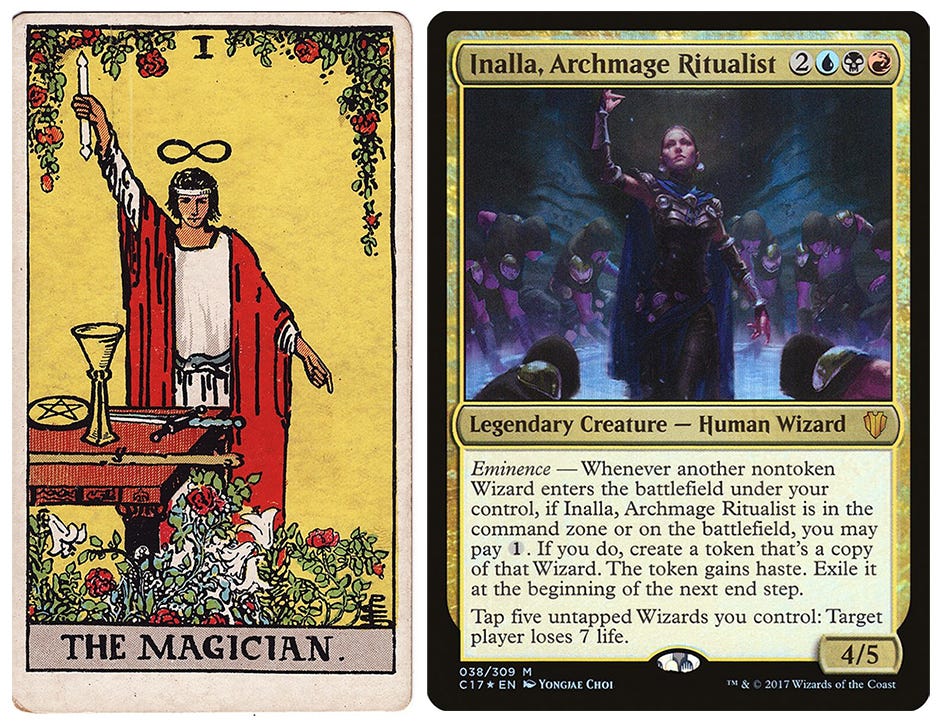
As a starting point, I looked at one of the most iconic decks; the Rider–Waite Tarot, published in 1909. The original artwork for Inalla, Archmage Ritualist by Yongjae Choi reminded me of The Magician card, and so I kept a similar pose in my art as an homage to both.
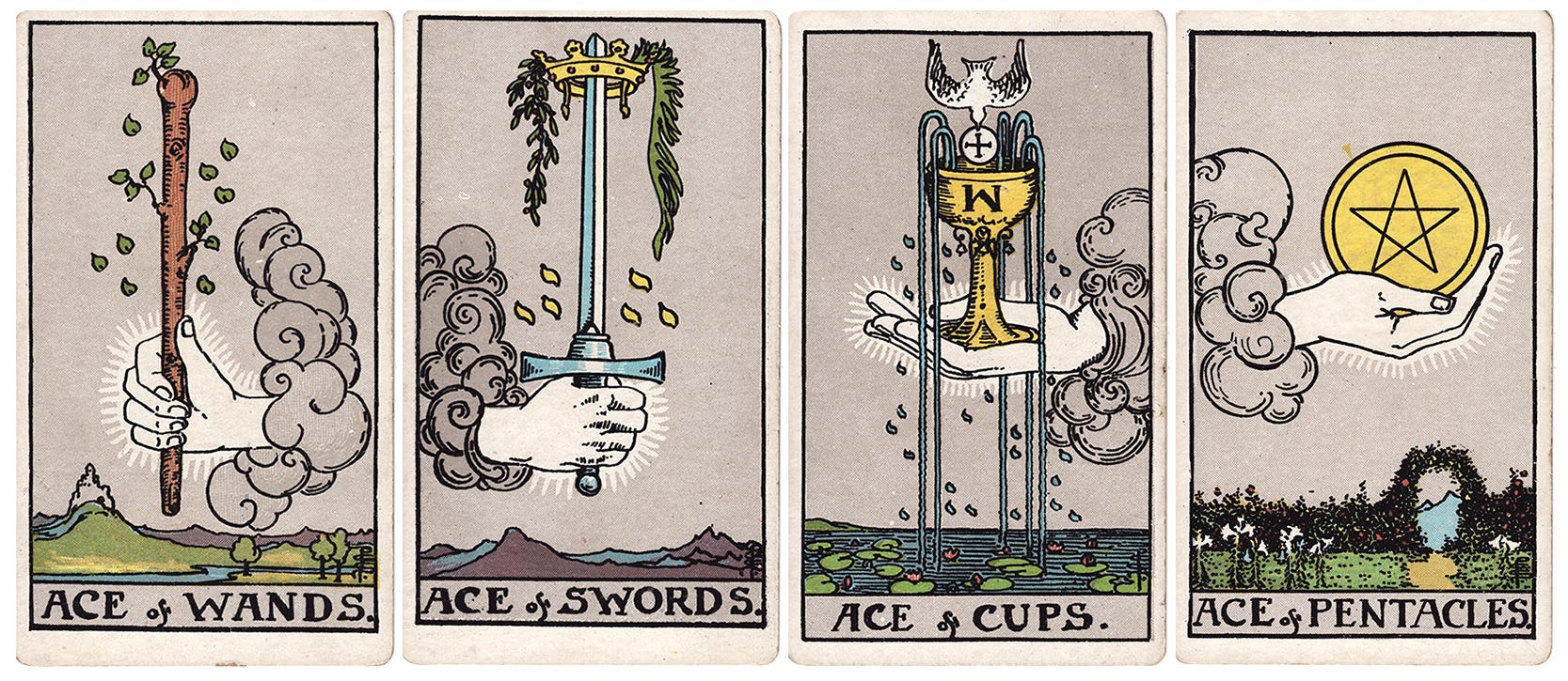
I also took inspiration from the ace cards of the Rider-Waite deck, as they tend to symbolise the main theme of each suit. There is a strong tradition of well-painted hands in Magic art, especially for artefact cards. Fortunately, all the ace cards focus on hands holding an object, so keeping the same focus in my cards was an easy choice.
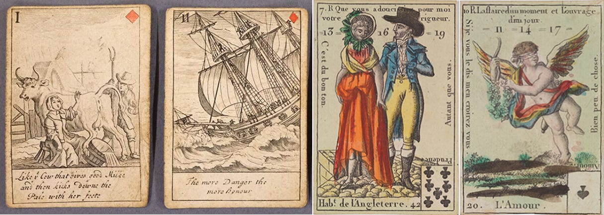
Reading more about the history of Tarot, I found several antique decks that were precursors to the modern day version we know today. Before being used for divination, Tarot cards were originally for card games. Many early decks were basically playing cards, with stories and information printed on them. For example, I found an 18th century deck featuring proverbs, and a 19th century deck showing costumes from around the world, with divinatory readings on the sides. I thought this was particularly noteworthy as Magic cards are similar in concept; being game cards with written annotations! So these antique decks became the inspiration for the presentation of text on my cards.
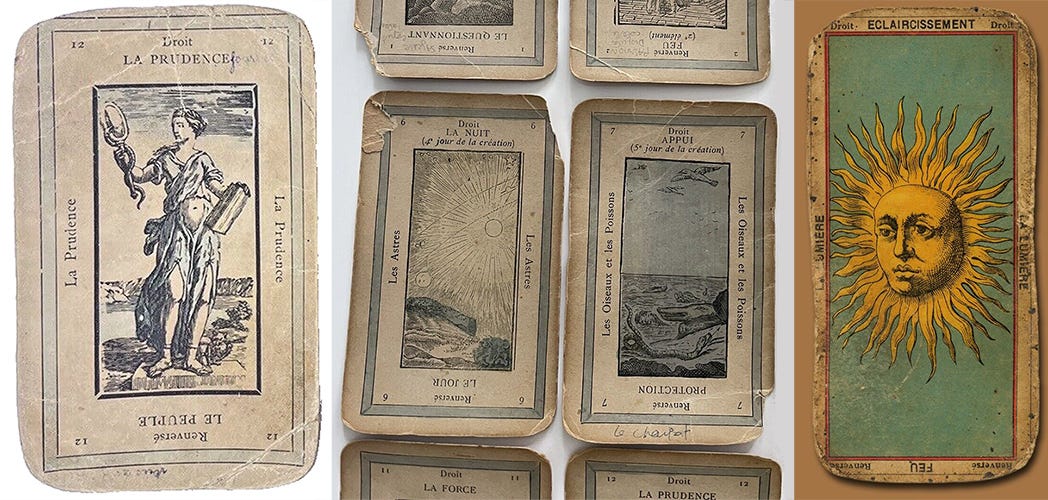
When looking at some of these cards, I thought that their aged and torn appearance lent a sort of mysterious quality to them, like they’d have their own stories to tell. Perhaps they’ve been passed down through generations, or might possibly be cursed?! It seemed a fun way to add an extra layer of narrative to my own cards - and frankly I just liked this aesthetic, so it became another point of inspiration.
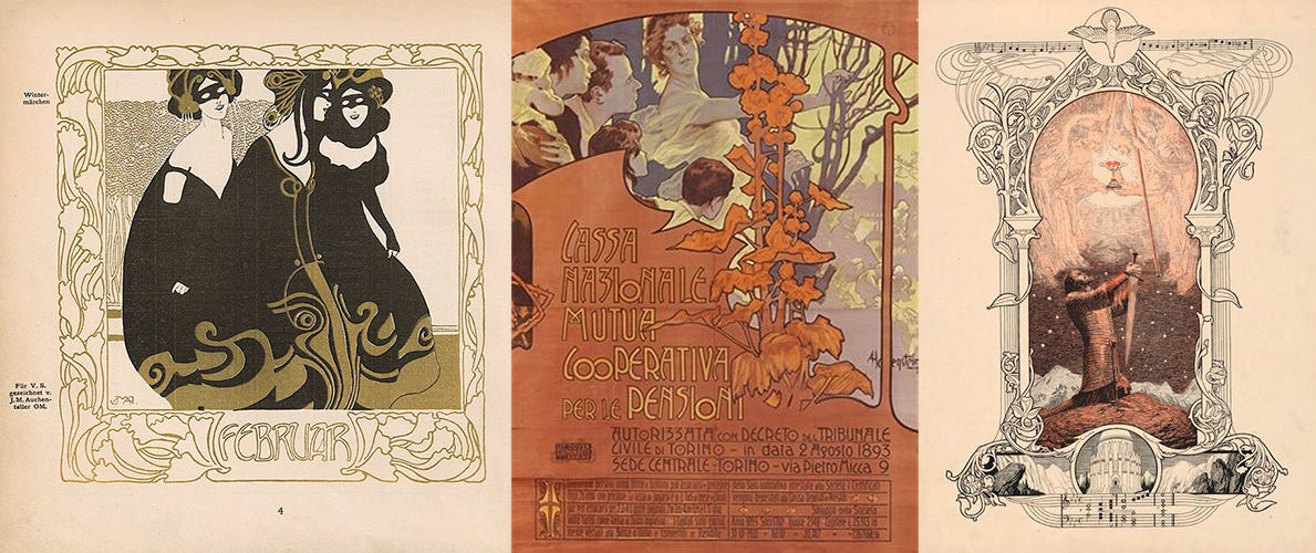
Outside of tarot, I was also inspired by late 19th century book and poster design. Art Nouveau designs from around this time often have a wonderful way of integrating text with graphical border elements and illustration, and this is something I’ve always wanted to experiment with. There aren’t many opportunities to do this kind of thing as an illustrator, since the design portion of a project is not usually up to me, with legibility and marketing also being key considerations. But having an open brief on this project meant that I could be a little more unorthodox with the frame and type design.
Inspiration for a project can often be vague, and there is not always such a clear line of influence. But because this project involved achieving a very specific theme and look, and a healthy dose of homage, I thought it would be worthwhile to discuss the creative choices that were made, alongside the things that inspired them!